You’ve put a lot of care into making your waiting room look and feel inviting, practical, and aesthetically pleasing—a place where your patients don’t mind hanging out. But have you given the same care and attention to your website? Your website is essentially the door to your practice. If it’s not also inviting, functional, and aesthetically pleasing for visitors, they’ll never make it to your beautiful waiting room.
It’s true that good dental websites are easy to find, but great dental websites are few and far between. Luckily, we’ve done the research for you. Below you’ll find an analysis of what we consider to be extremely effective dental websites—and how you can make yours stand out.
Here are 5 of the best dental websites we’ve seen:
1. CT Braces
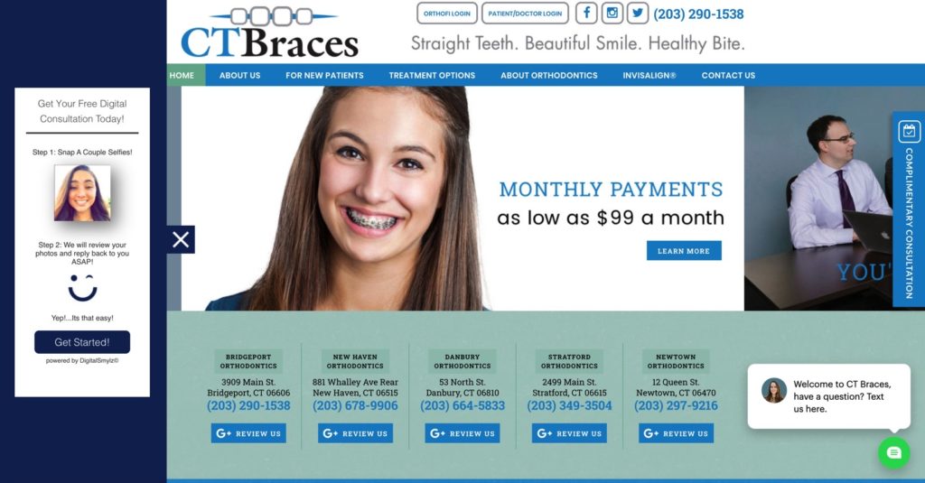
CT Braces’s website capitalizes on responsiveness and personalization. It sets itself apart by making the practice responsive via instant messaging, encouraging its visitors to text the office as its main CTA. With CT Braces’s Webchat feature specifically, a live chat conversation can move from desktop to mobile and back again, making it extremely convenient for both patients and staff.
This website offers excellent personalization through use of emoji, informal language such as “Yup!…It’s that easy!,” and the option to text for a free consultation. For an effective site, your landing page should be as personal and modern as you can make it, with multiple communication channels open—especially the option to text.
2. Dr. James Catt
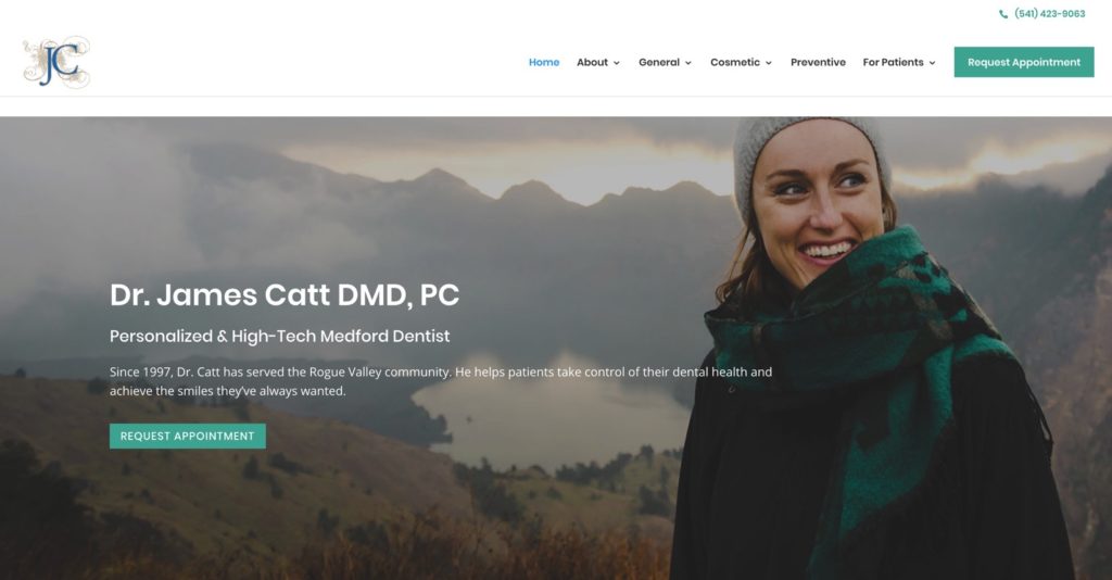
With this website, the keywords are clean and clutter-free. This background image implies care, exploration, and thoughtfulness, differing from the typical background of a smiling patient or the practice itself. The link flow is also very simple, and the tabs are emphasized by the excellent use of white space. Do you feel calm looking at this website? You definitely should! And patients should feel just as peaceful and at ease when they land on your website as well.
As we noted with CT Braces, personalization is a must in this vertical. Dr. James Catt does this really well by providing bios not only for himself, but his staff too, and actively upkeeping a blog section. If you can, include bios, blog posts on your dental philosophy (or philosophy of health, etc.), and clear images of your staff on your website. Patients should feel that they know you and have created a relationship with you even before they step into the office.
3. Tingey Orthodontics
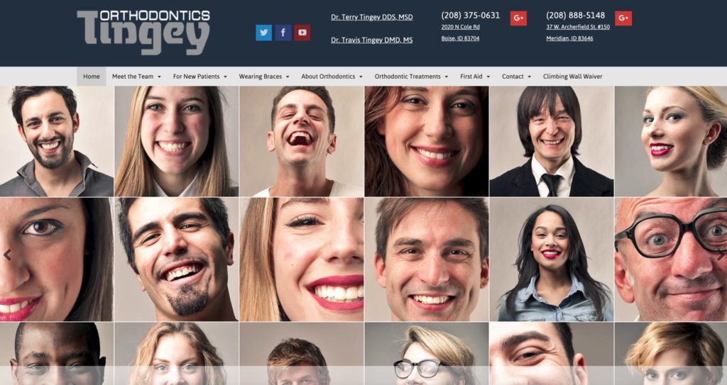
Tingey Orthodontics appeals to a wide variety of people with this diverse, highly inclusive background. Even from the landing page, their brand emerges as one that considers diversity and inclusivity important. In its unification of visitors under a common purpose/cause, it stands out from the pack by inviting the web visitor to become part of a movement, not just an orthodontics clientele.
But the brilliant thing about Tingey Ortho is that not only is their landing page aspirational, it’s FUN. Tingey Orthodontics clearly didn’t cheap out on photography here. Instead of the same old cliche patient photos, they captured the personalities of individual patients with high-quality photos and encouraged them to be themselves, making for an enticing collage on their homepage. Tingey Orthodontics cleverly appeals to the younger generation with a website that is both fun and aspirational.
4. Glo Modern Dentistry
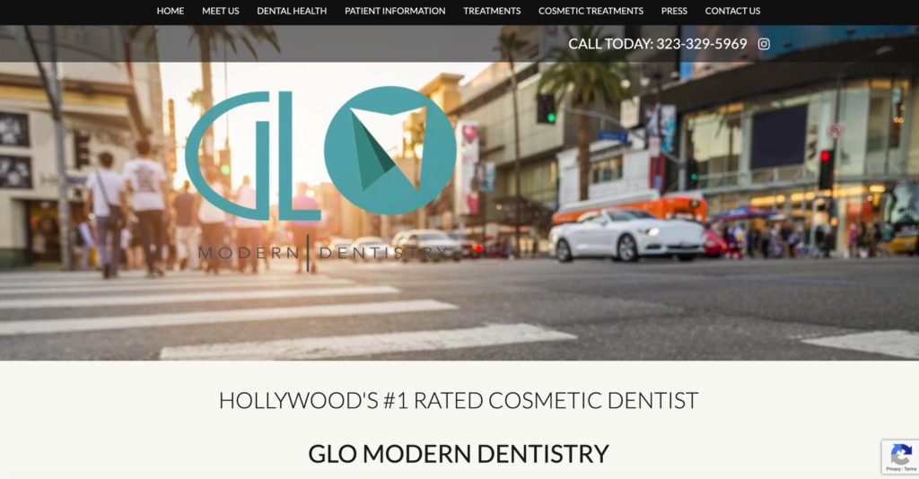
Glo Modern Dentistry creates high-impact in Los Angeles, a city known for its focus on cosmetology and beauty, with its premium and educational website. The incredibly clean and aesthetically pleasing landing page reflects the values of the city, and the use of white space and balance subtly emphasizes the beautiful effects patients will experience once they come here. This website offers great information if you click on the “dental health” tab on how to properly brush, floss, etc. With its many posts and advice sections, it demonstrates all around care and great content.
Glo Modern also doesn’t shy away from media or awards. It features them. This acts as a huge promo for the practice. Glo Modern links to a number of dental media articles and displays its #1 ranking proudly in front, one of only two lines on the feature landing page. Brevity works for Glo Modern here—they let their achievements speak for themselves.
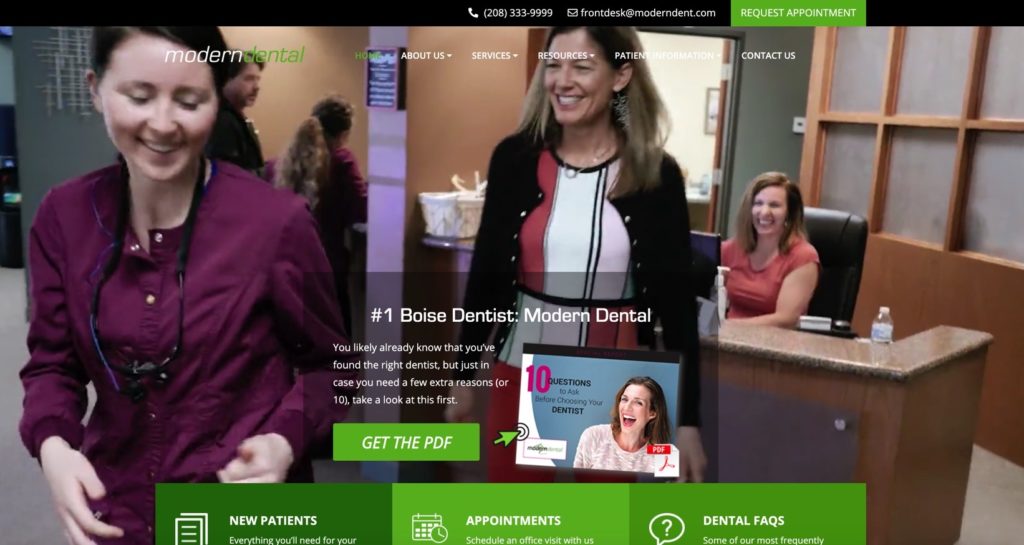
5. Modern Dental
Modern Dental’s website comes across as dynamic and helpful. This image may appear a little blurry, but that’s because we screenshotted it while a video was playing. This website features a consistently re-running video that shows the entire customer experience, emphasizing key touchpoints. Modern Dental understands the importance of being able to visualize the experience you will have before you step into the office.
We love that even before the CTA to make an appointment, patients are first invited to download an ebook on how to pick the right dentist. Not only is this informative and ethos building, it leads the patient back to Modern Dental with greater confidence that she has made the right decision and has the skills and knowledge to recognize what makes a great practice. This website also features a wealth of excellent content, setting it apart from the ordinary dentist website.
There you have it. Effective personalization, responsiveness, addictive content, clean design, and a flair for fun. But ultimately, perhaps the most important takeaway here is the principle of originality. Your website should reflect who you are. If you own your website (and follow these principles), you’ll leave not only your patients but your web visitors smiling—every time 🙂


