17 dental office designs to incorporate into your dental agency
Whether you are planning a new dental office or remodeling an existing one, you will need to consider the overall dental office design. You want to choose architecture that creates a nice flow and allows your office to work efficiently. You also want a design that seems professional yet not intimidating to patients.
It can be incredibly overwhelming to figure out how to layout and design your dental agency. Luckily, you can make the process easier by looking at some of the most popular architectural and structural frameworks as well as interior design ideas. We have gathered the most popular frameworks for you, conveniently dividing them depending on whether they focus on architecture and structure or overall design.
Top dental office architectural/structural designs
The following dental office designs focus on offering inspiration for structural or architectural elements. You can use them as inspiration for your dental office’s general format by seeing what types of layouts flow well.
1. Open, modern architecture
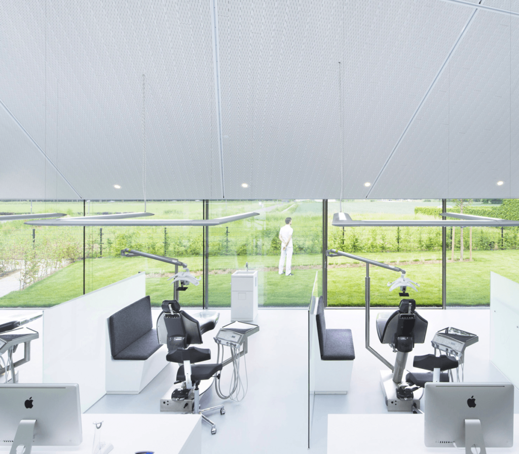
This particular example is from ortho Wijchen in Wichen, the Netherlands. It has an open and modern design, complete with wide windows for patients to look out while receiving care. The openness allows for a seamless flow, from the reception to the waiting area to the treatment area. Strategically placed skylights further enhance the open, airy feeling of the space.
2. Heavy use of glass in office design to balance privacy and openness
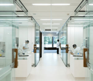
This glass-heavy architecture helps create a feeling of openness. At the same time, each patient receives privacy thanks to being in separate treatment rooms. It is an alternative to the vast open spaces of the previous example that delivers the same effect while using less square footage. If you are considering something like this with glass walls, be sure to consider sound insulation. It is a prevalent mistake to forget to consider wall thickness during design. You need to find a balance between enough space and enough sound insulation.
3. Circular architecture without hard lines
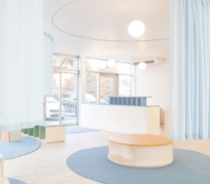
This particular image is from Schio, Italy, and was designed by Atelier Giavenale. Using softer lines, including circles, takes away from the harshness of the area. This flow helps create a more calming atmosphere for patients to enjoy and helps them relax. Simultaneously, the openness helps with a seamless flow between reception and the waiting area, along with the transition to the treatment area.
4. Architectural designs incorporated into the ceiling and walls
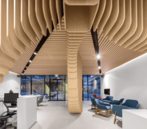
This type of dental design incorporates exposed architectural elements into the ceiling, walls, or both. In this case, it comes in the form of a series of wooden swoops that create calming lines. They combine seamlessly with the modern white walls, adding color to the office and preventing it from feeling too sterile.
5. Soft curves on the exterior of the building

You can also extend those soft architectural curves to the dental office’s exterior, even when the building itself is a square. Including half-circles and half-ovals creates a soft, welcoming feeling to greet patients as they enter your practice.
6. Incorporating elements of home-like fireplaces — into office design

This architectural design can take several forms, such as adding a fireplace to the middle of the waiting room. The idea is that it helps create a homey, relaxing feeling. We’ll touch on this theme again when focusing on the interior design aspects of dental offices.
7. Including structural pillars in office design
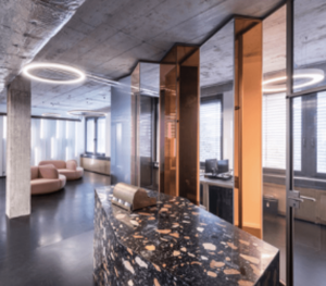
This design that incorporates structural pillars creates more of an industrial or urban feel. It works particularly well in urban areas.
8. Partitioning for small spaces in dental office design
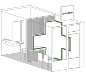
Dentists and architects must get creative in smaller clinics or locations where only one patient is seen at once. This design provides a nice flow and openness between the waiting area and the dental office. The partial wall blocking the two lets those in the waiting area let the dentist know they have arrived but still provides the patients being treated with privacy. This type of space is also a great example of incorporating flow by separating yet connecting patient and practice areas.
Popular dental office interior designs
The following images focus on the design or stylistic aspects of dental offices. Look at them for inspiration on how to create a professional, relaxing, and unique interior that keeps your patients relaxed during their treatment. You will notice that none of the designs sacrifice the architectural plans’ flow, as flow is crucial for dental offices. After all, your patients and staff must be comfortable in the space.
1. A homey feeling in the waiting area — with modern styling
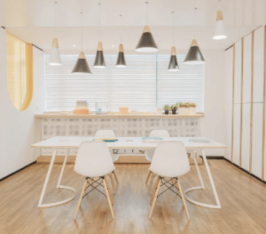
One idea that is growing in popularity is creating a waiting area that feels more like a home. It can feature a table and chairs or comfortable couches like those you would find in a living room. The above example is a more modern option. This type of homey feel is popular, as you want your patients to have productive and pleasant visits. One report indicated that 69% of dentists feel that patients look to the overall design and layout of the dental office as a way to gauge the competence of a dentist.
2. A homey feel in the waiting area — with traditional styling
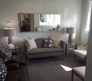
If you prefer, you can opt for classic couches and warmer colors, creating the same type of homey feel as the previous design, but with a slight difference. The richer colors create a more calming atmosphere. Simultaneously, the use of the type of furniture you would find in a home helps patients feel comfortable.
3. Built-in couches in the waiting area
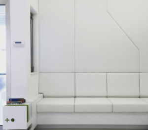
This type of design provides the comfort of a couch yet sticks to a more professional appearance instead of a homey feel.
4. Incorporating bold colors in interior design
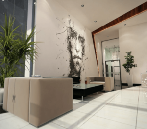
Incorporating bold colors into dental offices helps energize patients. Some of the most popular shades are reds, greens, blues, oranges, and metallics.
5. Don’t be afraid of using a lot of color in office interior design
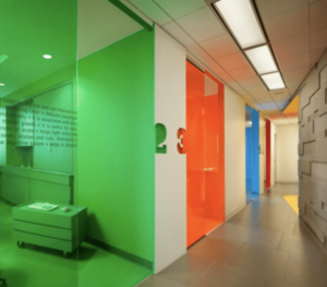
While the previous design incorporates pops of bold colors, some dental offices choose to take this to the next level. In the above picture, large swaths of vibrant colors replace the sterile and nerve-wracking feeling of a dental office with a fun and an overall pleasant experience.
6. Exposed timber and other natural elements
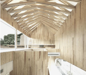
Contrasting with the idea of bold colors, this design tries to make the interior feel more natural. The idea is that nature and relaxation go hand-in-hand.
7. Using recycled glass in interior design
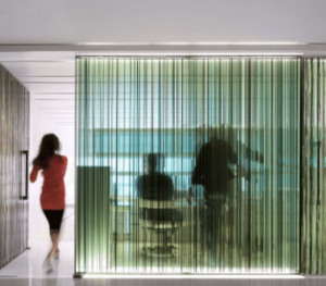
We discussed incorporating glass as an architectural element, but it can also fall into the dental office interior design category. In this case, recycled glass creates a unique appearance and makes the office more environmentally friendly. That eco-friendliness helps you as the dentist feel as if you are making responsible decisions and can attract patients.
8. Keeping things exciting for kids

Pediatric dentists are embracing interior design that appeals to their target clientele. Instead of the old games previously seen in waiting rooms, there are tablets with games or arcade games found in newer dental practices. The overall design of this particular example is also more energizing and kid-friendly. At the same time, there is still a more traditional area that adults will appreciate.
9. Including elements that are child-sized
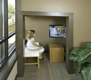
Another dental design trend among pediatric dentists is to include child-sized elements, other than just chairs. For example, the above nook gives pediatric patients a place that is designed specifically for them.
Equipment and technology
As you plan your dental office design and architecture, do not forget to account for the various equipment and large technology you may need. From patient exam chairs to x-rays, remember that you will need to have space for the following equipment.
- patient chairs with comfortable features and full adjustment
- sterilization equipment
- dental equipment for during procedures, including dental compressors, separation tanks, vacuums, amalgam separators, and more
- handpieces
- delivery systems for air and water
- dental operating lights
- cabinetry to store required equipment when treating patients
- x-rays and related equipment
- bathroom facilities for patients and staff
- reception area
- waiting area
Conclusion
With the right inspiration from popular frameworks for dental office design, you do not need to feel overwhelmed as you work to design your office space. The various frameworks we gathered should provide the inspiration you need, whether you choose to use one in isolation or combine them to take advantage of the benefits of more than one design. As you plan your office design, remember to visualize how the necessary dental equipment will fit in.
If you want to work with a company that can accelerate your sales and promotion, consider joining the Podium partner program.


